
Broke the 2010 goal of doubling monthly traffic
With the refined website, Blue was able to interact more with their guests, and guests were able to interact more with Blue.
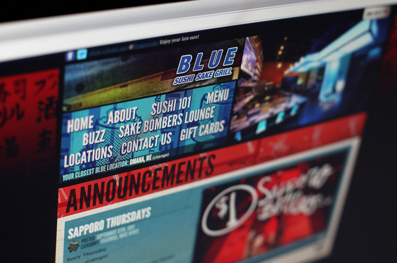
Homepage
News and event postings, plus social media sharing made most of the content readily available for the user before having to even click.
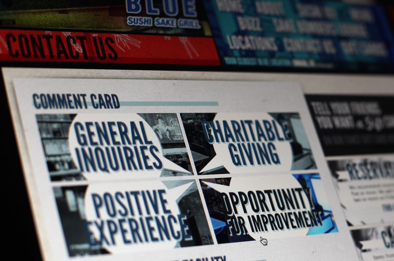
Comment Card: One of the most overlooked features of a restaurant’s website
7 out of 10 guests don’t complain, they just don’t come back. The comment card makes it easier for guests to speak up.
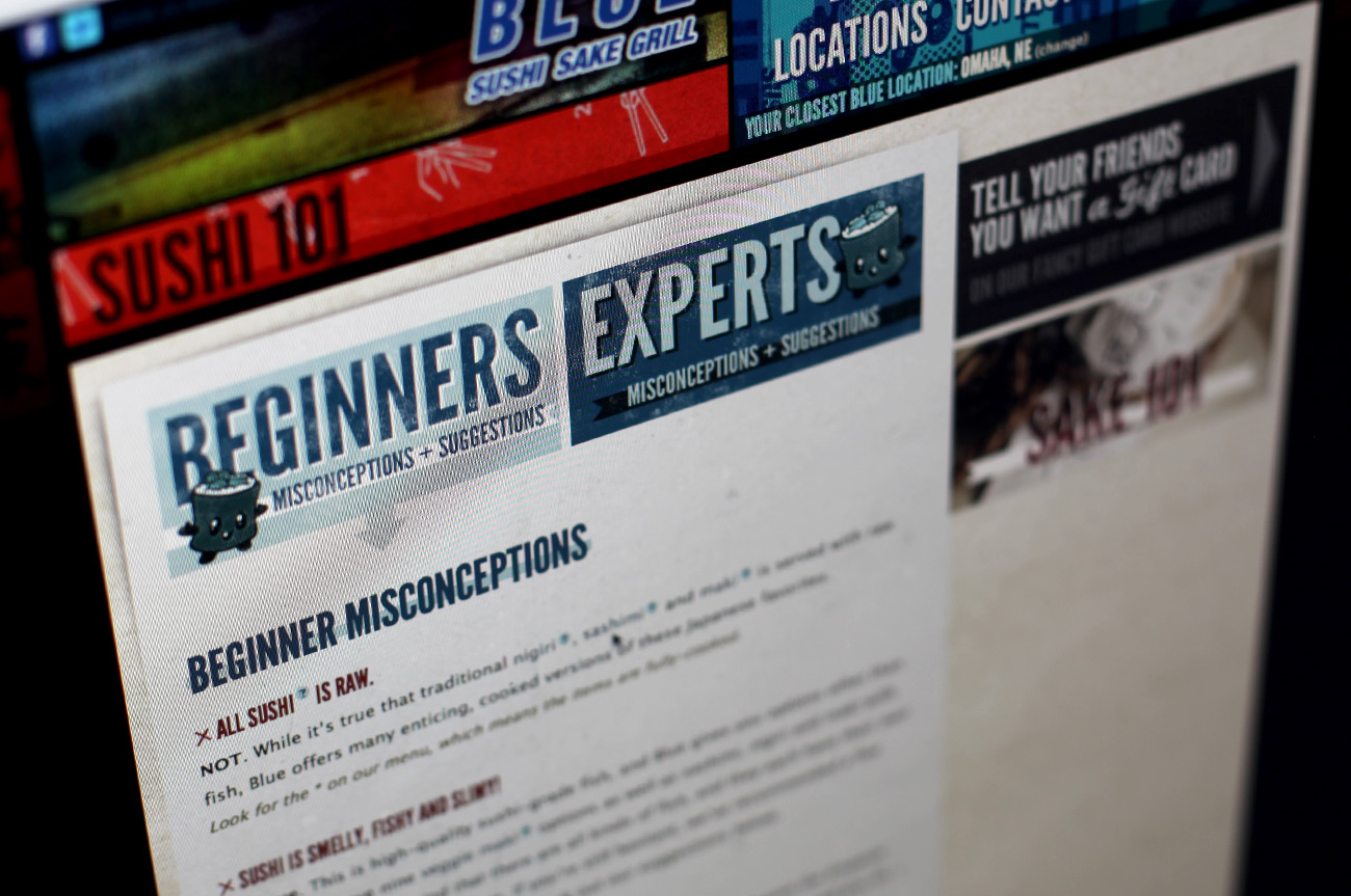
Sushi 101
This section was built to help educate people unfamiliar with sushi, as well as give them tips. This also helped bring in traffic by providing more value to the guests.
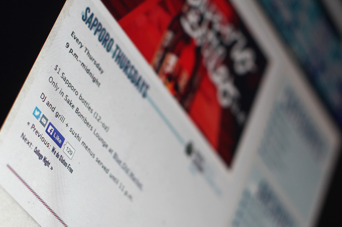
Sharing
Updates are easily shared through social media, making these links spread exponentially faster than before.
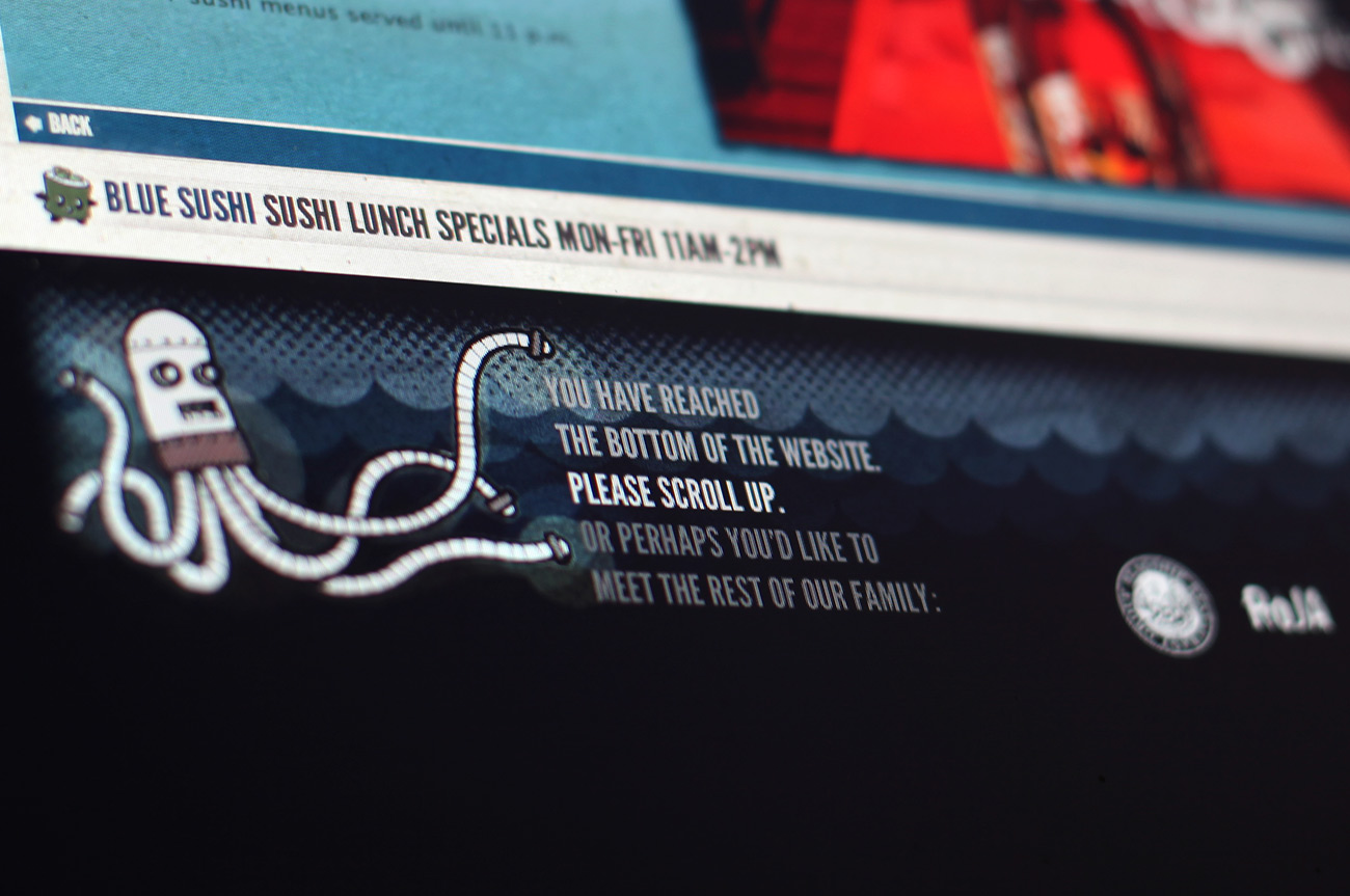
Quirky surprises
One objective was to make the brand more approachable. We added quirky elements such as the Roboctopus and conversational copy throughout the site.
