Merging two banks
We worked closely with the team from both banks during the merger to create the new Core Bank.
Built from the inside out
Branding built from the inside out is the only way to build strong and long-lasting brands. Otherwise, it’s an empty shell with visuals / communication presenting a hollow message. So, we worked with the branding officer to get input from the employees to create the brand attributes. The video above is that story.
Brand Values
The brand values came straight from the employees through the workshops.
Brand Attributes
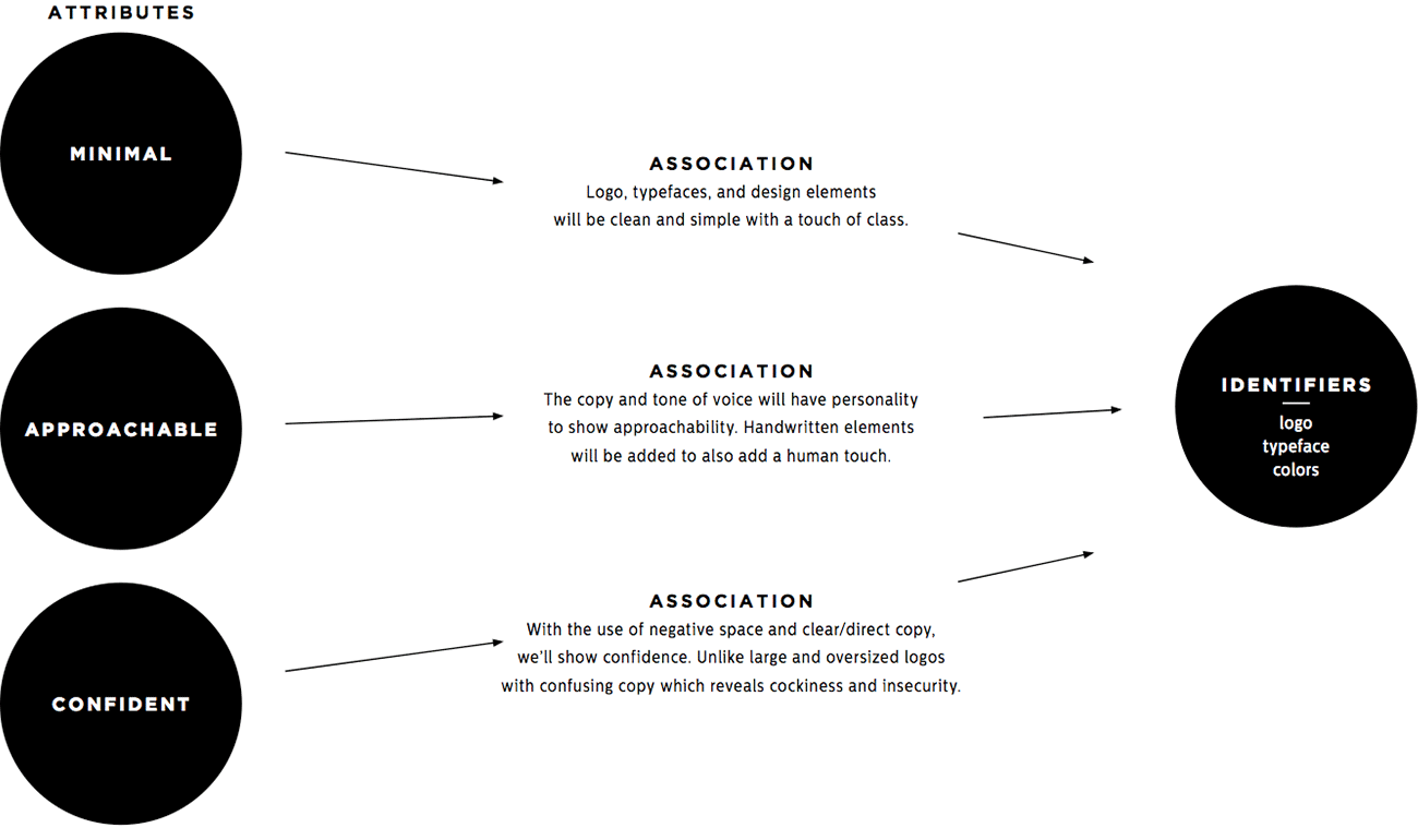
A brand’s identifiers, such as the logo, never quite captures the brand until you become accustomed to or learn the brand story. It happens over time with associations. So, we create a plan to ensure it does.
Core Code: Employee Handbooks
We took the mixture of the brand values and the attributes to create the Core Code (employee handbook). Almost as important as the Core Code, was the process of having the employees come together to agree on this.
Many employee handbooks get thrown in a drawer and forgotten about. These were designed to be displayed and touched by having thick soft black Pilke paper encasing beautiful 220 lb letterpressed pages. The CEO then signed each one by hand.
Unlocking the Brand Event
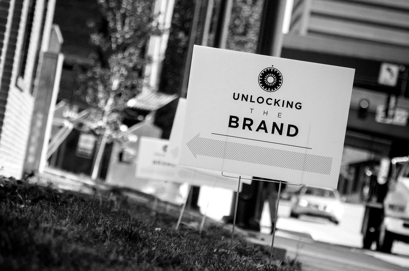
We unveiled the new brand to the employees one night, and then to clients the next.

The Reaction
At the end of the video (the video at the top of this page), the logo and name revealed itself. The employees clapped and cheered!
Celebration
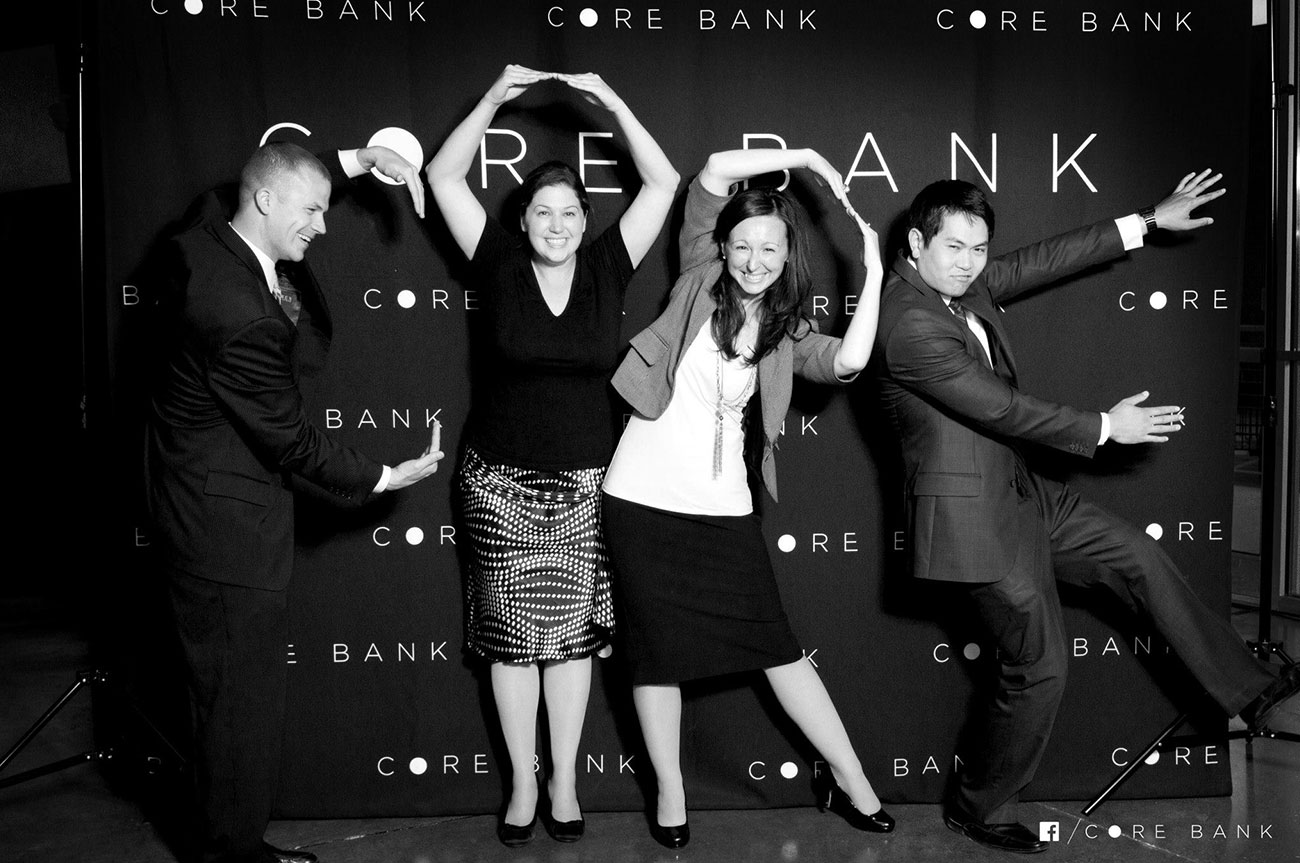
Afterwards, we dropped the new photo booth background and the employees celebrated.
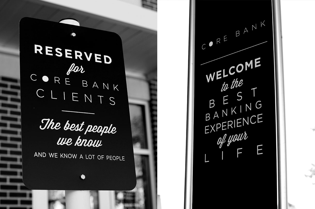
More than just signage
Created 3 experiences for 3 different audiences – clients, potential clients and employees.
CLIENTS: They pull up to their reserved spot and already feel appreciated. The banking experience is usually not something we look forward to. It’s more of a necessity, and sometimes a burden. As they go to the door, they are reminded that Core Bank strives to make this necessity enjoyable. A whole new frame of mind is created for a pleasant experience.
POTENTIAL CLIENTS: When they walk by, they see how highly Core Bank regards their customers. They may experience a bit of jealousy or curiosity and think, “I’d like a bank that treats me this way.”
EMPLOYEES: It’s not often that employees read their handbooks more than once (or at all), but there are important values usually hidden in those. These signs serve as simple reminders of some of those important values and customer promises while not being an overbearing experience or a corny motivational banner.
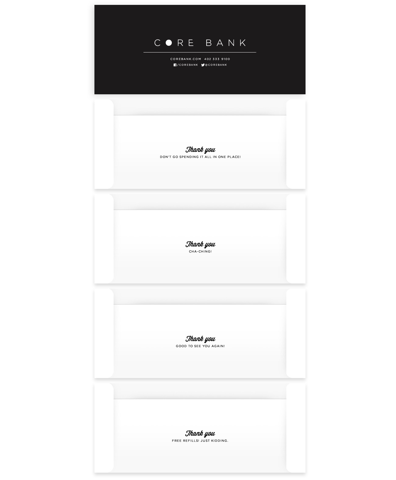
The Drive-Thru Experience
Clients coming through the drive-thru are in a hurry. With Core’s focus on service, it’s challenging to provide any to guests that are waiting in their car. We added welcome signage, farewell signage, and a surprise message on the backs of the teller envelopes.
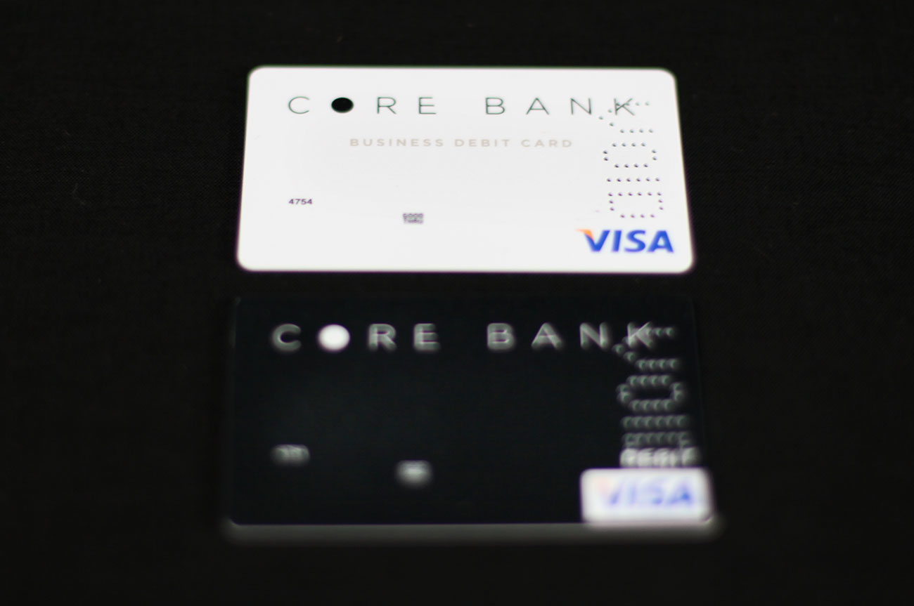
Debit Cards
Clean, minimal and sleek. No fake marble patterns here, just a beautiful pearl finish with contrasting front and back.
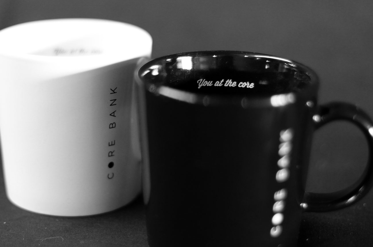
You at the core
The guests using these mugs are in for meetings. We wanted to remind them they are at the core, and we do so after they take their first sip.
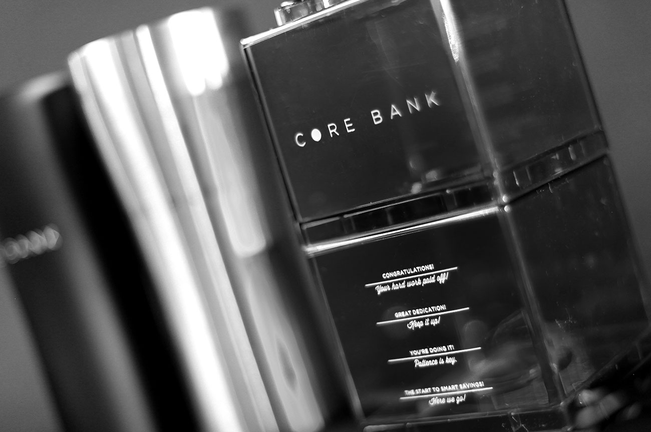
Leaving a positive effect on children
The kid’s bank represents financial planning being a building block in one’s life. But more importantly, we added goals on the side to motivate kids throughout the saving process. Rather than just create an object, we created an experience that can help shape a child’s spending/saving habits for a lifetime.
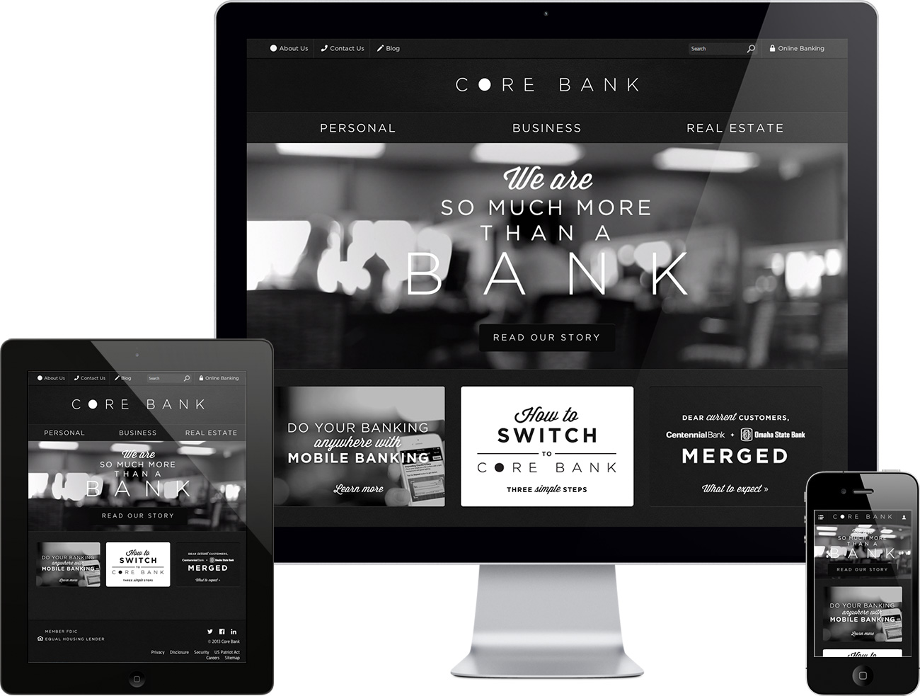
Responsive & Minimal Website
We analyzed the analytics for 2 weeks to figure out what could be cut, combined, edited and could stay. This site has a lot of information. We pinpointed 3 users: People with Personal Banking needs, Commercial Banking needs, and Real Estate banking needs. Rather than bombard the users with tons of options, we let the user decide which path to go down first. This website is responsive to work seamlessly on tablets and mobile devices.
CoreBank.com
