The purpose of this license plate was to incorporate the We Don’t Coast branding.
One of the challenges was creating a design that encompassed a commonality of the people who supported We Don’t Coast. We went back to the research documents for the We Don’t Coast brand: The majority of people love this area because of the community.
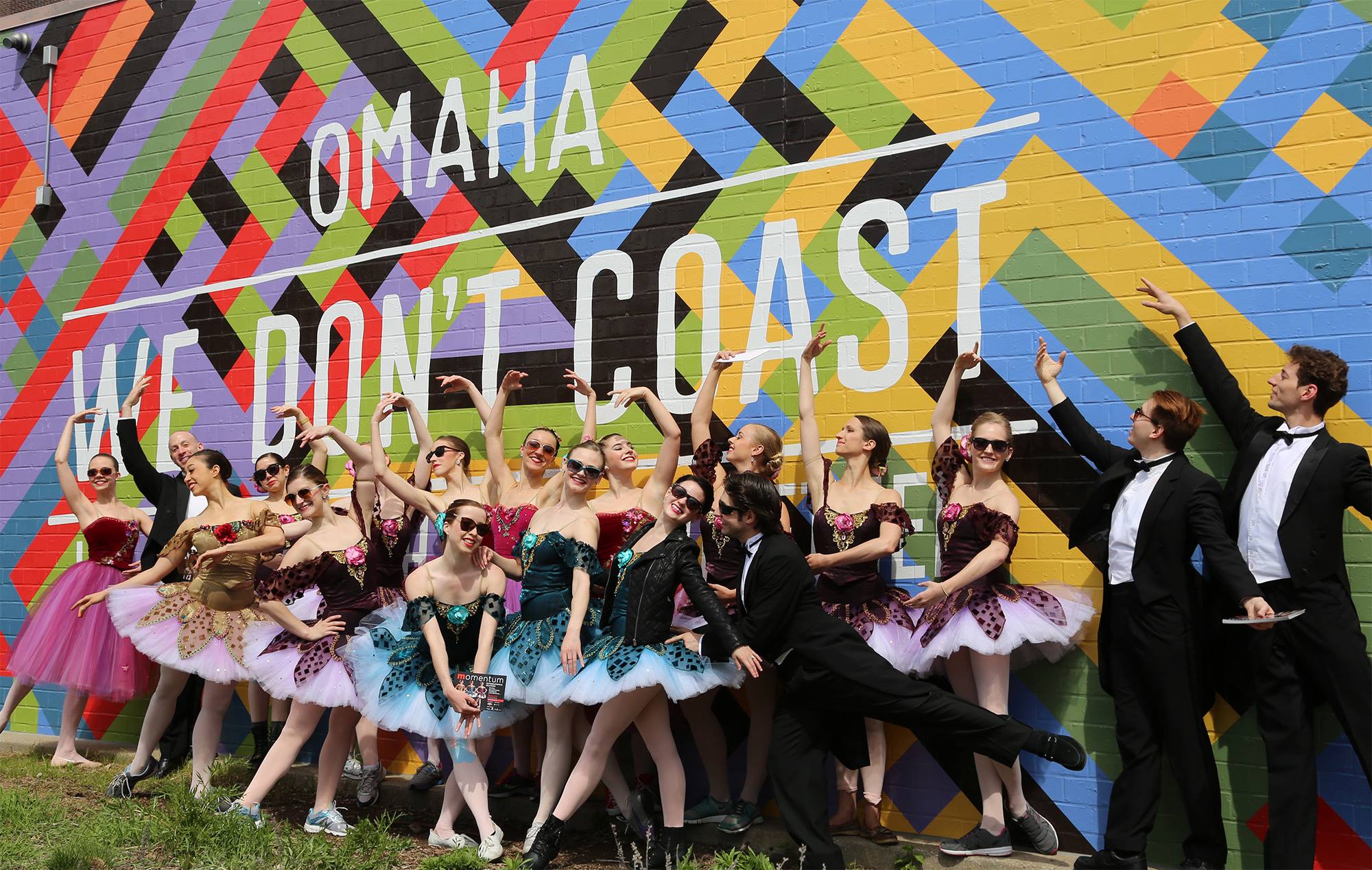
So, it made sense to use the Community Pattern from the We Don’t Coast brand visuals (shown in the mural below).

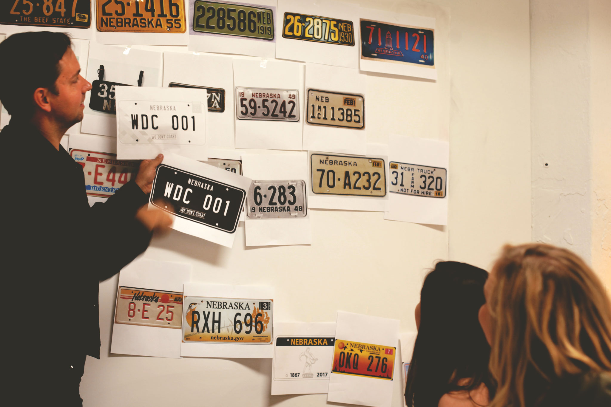
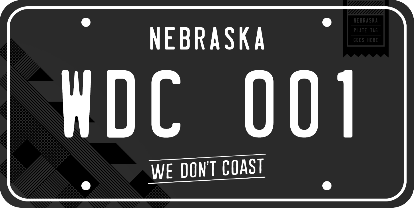
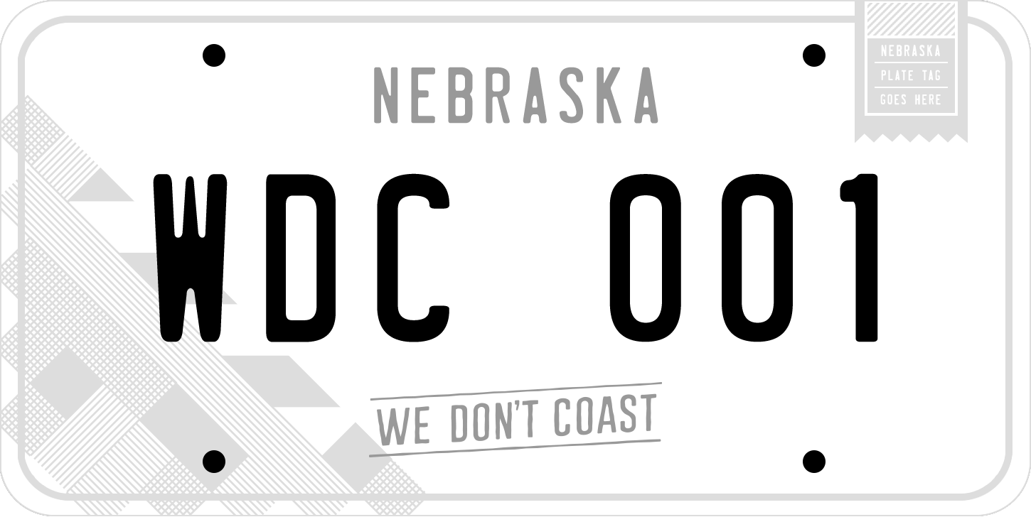
We loved the old classic license plates, and wanted to build from there. After many variations, we arrived at a clean black and white version with subtle details.

We ultimately fell in love with the black on black with white lettering. It felt classic, yet modern.

The day before presenting, we heard back from the DMV that they could not do white lettering… even after some begging and pleading.
So, we went with our close second choice; the clean, classic and sophisticated white version.
A few have commented they want more color or images represented. We deliberately avoided that to focus on it being a non-intrusive item to fit any car; allowing individuals to showcase their interests through bumper stickers instead.

Get Your Plates Now »
104 of 250
